New Relic has the most generous metric cardinality limits in the industry. Thanks to the power and scale of the underlying data platform, New Relic can easily handle data in an account with millions of unique metric time series on any given day.
But, like every SaaS platform, we impose reasonable limits to ensure protection for the system along with a performant experience for all users. When you reach those daily limits, the system will stop generating aggregate timeseries data, resulting in visible gaps in your time series charts.
Today we are releasing a new cardinality management UI that makes it easier to diagnose and solve metric cardinality issues, so that you can prevent visual data gaps and gain more control over cardinality. In this blog we’ll walk you through how to use this new feature to:
- View account usage over time. See cardinality usage trends vs. budget within your account.
- Get a metric level breakdown. Understand which metrics are driving the most usage.
- View and prune attributes. Dive deeper into a metric’s attributes and prune (remove) high cardinality attributes to free up cardinality budget.
Easily monitor and manage cardinality within the New Relic UI.
How does cardinality work in New Relic?
Cardinality in observability refers to the number of unique values in a data field, with high cardinality providing granular insights that enhance troubleshooting, anomaly detection, and predictive analysis. Robust attributes, which we sometimes refer to as dimensions, within metrics are essential for answering unstructured questions about your data. An increased number of attributes in metrics usually leads to higher cardinality requirements.
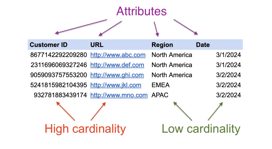
In this sample of a larger set of data, “Customer ID” and “URL” are attributes with exponentially higher amount of unique values than the “Region” and “Date” attributes. Learn more about cardinality here.
Cardinality budgets
While more cardinality empowers valuable detail for understanding complex systems, it also presents challenges of data volume and query performance. Limits, such as the daily cardinality limits enforced by New Relic on each account and on each metric, help keep your queries running faster while protecting your account spend and performance.
If you encounter one of the cardinality limits, a few things happen:
- New Relic reports an
NrIntegrationErrorin your account, which is an event you can query using New Relic Query Language (NRQL) to understand data ingest, limits, and feature configuration. - You’ll also see it in the limits section of the Data Management Hub in New Relic.
- Once a limit is reached, New Relic continues to process and store all of your data but halts the creation of the rollups (aggregates) for the rest of the day. If you’re looking at a query that spans more than an hour when this occurs, you might assume data has stopped reporting, because the rollups used for these longer time window queries are not available. No need to worry—the raw data you sent is still available to query.
Learn more about limits in the docs.
Managing your cardinality with ease
We’ve added the new Cardinality Management menu to help make controlling your cardinality easier.
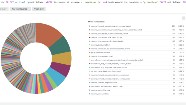
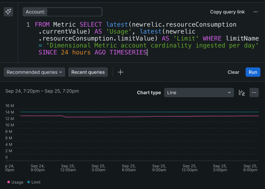
Previously, diagnosing cardinality issues would have required the query explorer and extensive NRQL knowledge. For example, you would need to look up which metrics are high in cardinality, then find which attributes within metrics are the culprits. This resulted in a complex query:
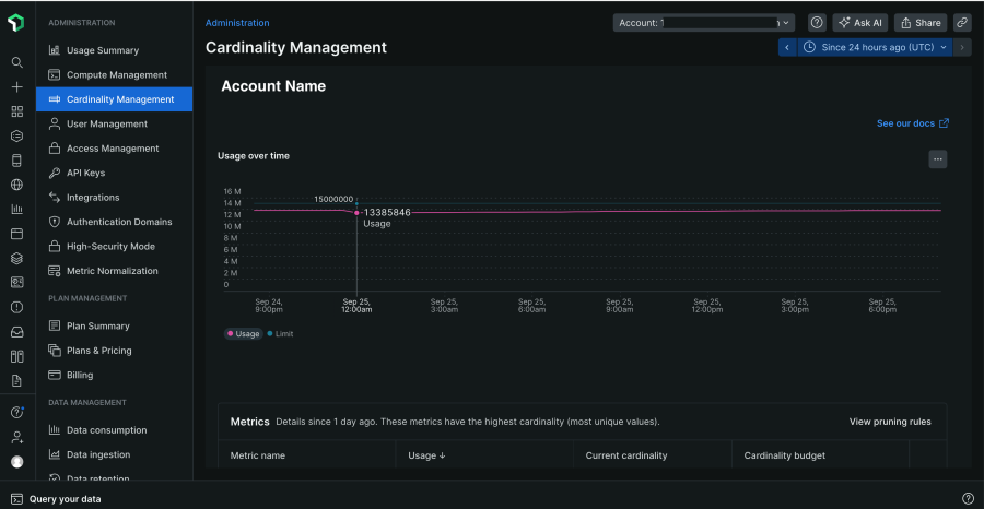
Now, you can understand this in just a few clicks. To navigate to the new Cardinality Management UI in New Relic, simply click on your name in the bottom left corner. Next, select Administration, and then select Cardinality Management.
This new Cardinality Management UI allows you to:
- See cardinality usage trends vs. budget within your account.
- Understand which metrics are driving the most usage.
- Dive deeper into a metric’s attributes and prune (remove) high cardinality attributes to free up cardinality budget.
Check on your account cardinality
At the top of the main Cardinality Management page, you can see information related to the specific account you’ve selected. As with most capabilities within New Relic, you can change what account you’re currently viewing by selecting the account picker in the top right corner.
Usage over time
The first chart on this page shows a timeline of the current account limit as well as the current cardinality usage for the account, which you can adjust with the timepicker in the upper right of the page.
Metrics table
Underneath, in the Metrics table, you can see the breakdown of account cardinality by metric name. This table shows the top 20 highest cardinality metrics in an account. The table provides the following details:
- Name of the metric
- Current overall usage of the metric (the ratio of current usage to current limit)
- Actual values of the current cardinality
- Current limit of that metric name
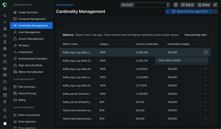
Dive deeper into metric cardinality usage
You can view a deeper layer of granularity in your metrics by clicking on any metric name in the metric table to view a breakdown of the specific metric's cardinality details.
Metric-specific usage
In this metric-specific view, you can see the current cardinality usage (Metric cardinality budget) as well as the overall account usage (Account cardinality budget) as two bar charts. Below the bar charts is a chart of a timeseries query showing the metric cardinality usage versus the limit of that metric. Again, you can change the timepicker to view different time periods of this individual metric's cardinality data.
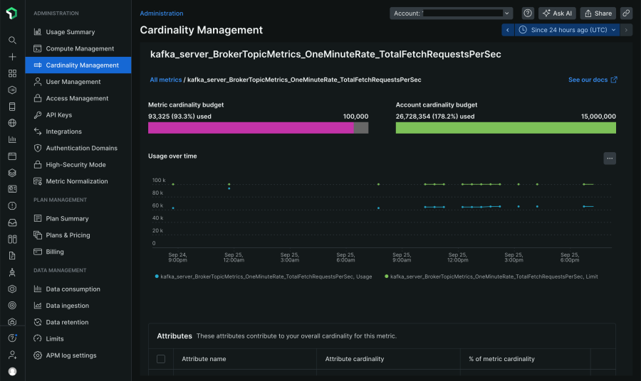
Attributes table
Under the timeseries, a table shows the attributes that are powering the metric cardinality, as well as the calculated proportion of metric cardinality. It’s a good indicator of what your highest contributing attributes are.

Prune high cardinality attributes
Metric aggregate pruning allows you to specify one or more attributes to exclude from metric aggregation. Pruning is ideal for high cardinality attributes sometimes included in metrics, such as a container ID or other unique identifiers. These high cardinality attributes contain important details when troubleshooting during an incident (for a narrow time window), but they lose their value over time and aren’t relevant when looking for longer-term trends.
Previously, to avoid hitting limits, you could prune aggregate metrics using NerdGraph. Now you can manage pruning rules within the UI.
View, create, and delete metric pruning rules.
Note: Pruning vs. dropping data
- Pruning attributes or metrics: Refers to stopping the creation of aggregates or rollups for selected metrics or their associated attributes. You can still query pruned data as raw data using the
RAWkeyword. - Dropping: Refers to discarding data entirely from the New Relic database. Learn more about dropping data in the docs.
Create pruning rules
In the metric-specific page, select the checkboxes next to the attributes you want to prune. Then select the button Create pruning rule and fill out the rule name. It will then show the effect of pruning on metric cardinality.
View and delete pruning rules
In the attribute table of the main Cardinality Management page, you can view pruning rules by clicking a metric name and then selecting View Pruning Rules. From there you can optionally delete rules as well.
Next steps
The new cardinality management menu makes it simple to diagnose, solve, and manage metric cardinality issues. To try it yourself, go to Cardinality Management or learn more in the docs.
The views expressed on this blog are those of the author and do not necessarily reflect the views of New Relic. Any solutions offered by the author are environment-specific and not part of the commercial solutions or support offered by New Relic. Please join us exclusively at the Explorers Hub (discuss.newrelic.com) for questions and support related to this blog post. This blog may contain links to content on third-party sites. By providing such links, New Relic does not adopt, guarantee, approve or endorse the information, views or products available on such sites.


