Regardless of the industry, every company is now a software business. The modern architectures enabling these businesses are becoming increasingly complex and difficult to manage. Increased complexity means increased risk, further exacerbated by a lack of understanding of the system as a whole.
One response to this increasing complexity is the rise of microservices, which let organizations build software in which specific functions can evolve independently from the rest of the system. This usually allows those functions to scale and move faster. Microservice architectures also help teams isolate complexity, making it easier to solve for a particular problem. But microservices bring their own challenges: how do you give teams visibility into particular service behaviors and how do you manage the ways each microservice interacts with all the other services in a dynamic environment.
These trends and fundamental challenges led us to create a tool specifically designed to help our customers view and understand their complex microservices architectures. Once understood, architectures can be better managed.
So that’s why today we are happy to announce a new feature in New Relic APM that's designed to do exactly that: Here come Service Maps!
Service Maps are a new map visualization feature in New Relic APM specifically designed for microservice and modern architectures that have many decoupled apps, services, and components. Service developers who build these services, ops and site engineering teams that support them, and DevOps teams that do all the above—you can now rejoice! Service Maps will help you better understand your complex software architectures by creating a visual, real-time map that represents your specific view of the world.
Auto-generated dynamic magic maps
Using visual aids to represent complex architectures is not a new concept. Large-format network or architecture diagrams built in Visio or Omnigraffle have a long history in software businesses. Although useful, these diagrams can be time consuming to create, often require input from numerous people or teams to provide a complete picture, and may become out of date almost immediately due to constant architecture changes.
Service Maps will not only show a representation of your architecture as seen by New Relic APM auto-magically, but any changes to the architecture will be reflected in the map. Real-time health status for components shown on the map are made visible for troubleshooting purposes, including evaluating the health of incoming or outgoing connections for each specific app.
We worked hard to make creating Service Maps fun and easy, including special assistance getting started:
- A welcome screen is presented if you have no previously viewed maps, which will suggest interesting applications to start from based on throughput, visits, and connectedness.
- If you have previously viewed a map, the last map viewed will be automatically loaded on your next visit.
- Clicking on the “Service Maps” link in the left nav bar while viewing an application in New Relic APM will automatically create a map starting with that application.
Service Maps to support multiple perspectives
Every individual and team supporting a service or collection of services as part of a platform that provides a business capability will have a unique view of what is most important. We believe this customized perspective is a core concept of microservices architectures, which holds that autonomous and independent services enable teams to move faster while still participating in a larger ecosystem. From our perspective, the impact of change, from the perspectives of the service and the system as a whole, is critical to understand these types of architectures.
To illustrate the core concepts and feature itself, let us use an internal example of the New Relic Alerts, which is also made generally available today, and look at some Service Maps representing the view of the world from the New Relic Alerting team.
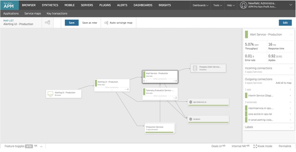
The first perspective we will look at is the view of the alerting system from the developers of the UI components. Their primary focus and interest are the Alerts' UI-related services and components that they designed, developed, and will support both independently and as part of the larger New Relic Software Analytics Platform architecture. This narrow view is represented in a custom Service Map that shows just those core UI components that are important to that team:

This map was created and customized to show only the relevant components for the Alerting UI since that is what is the most important to the team. This includes the following:
- Incoming browser connections from end users
- A Postgres database used by the Alert Service - Production
- Dependencies on other apps/services as they relate to the Alerting UI, including both Alerting and core platform services
- 3rd-party external services
- Less interesting services are shown as a group to minimize clutter on the map but remain important as context
The UI team can reference this Service Map to see how changes to the architecture and dependent services impact their own services in real time.
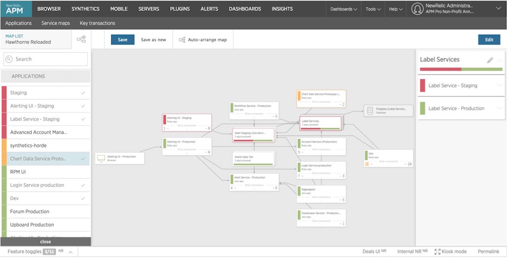
Now let’s take a broader view, from the ops and site engineering teams involved in keeping the New Relic Platform and products humming. The alerts components are small pieces of a much larger microservices architecture that support all New Relic products; understanding the boundaries of the alerting system and the connections and dependencies among internal New Relic and external services is important for support, scaling, and performance optimizations. This larger custom Service Map has been created to show this broader perspective:

This map is significantly more complex, as it represents the entire alerting system and other New Relic Platform services consumed by the alerting system. Discovering inter-service connections and dependencies and seeing the real-time health of both core and dependent services is helpful in reducing complexity through visual understanding. We can see from this map that there are a number of services in poor health, which could be causing upstream or downstream issues. When things go bad, the ability to quickly identify both impact and causality can ease troubleshooting this complex architecture.
Sharing this understanding is particularly important for large teams supporting complex software architectures. Situational awareness can help everyone make better decisions. So we made it easy to save and share maps with others in your account. Shared maps can help drive a shared understanding of different perspectives for complex architectures between teams. The permalink function in the footer generates a unique URL specific to your map, which can be sent to others to quickly see that specific map.
Now, go out and play!
The Service Maps feature is released for general availability, and is currently being rolled out to all New Relic APM customers with a paid account. If you don’t see the Service map tab in your APM navigation bar, please be patient—we promise it will show up soon!

General availability of Service Maps is just the beginning of ongoing work in both spatial and temporal visualizations in APM and across the New Relic Software Analytics Platform. We aim to continue active development on these and similar features will continue over the coming weeks and months.
Getting to this point and releasing the feature has been incredibly challenging yet rewarding for the awesome team who worked on it. We would also like to extend our heartfelt thanks to the many customers who provided invaluable feedback during the beta MVP. That input helped shape our philosophy around solving for the explosion in services and complex environments, leading to a map-based visualization tool in APM. We hope you all have as much fun using it as we have had building it.
For more information on Service Maps, see:
- Service Maps documentation
- Service Maps configuration documentation
- New Relic's Modern Software Architectures press release
Background image courtesy of Shutterstock.com.
The views expressed on this blog are those of the author and do not necessarily reflect the views of New Relic. Any solutions offered by the author are environment-specific and not part of the commercial solutions or support offered by New Relic. Please join us exclusively at the Explorers Hub (discuss.newrelic.com) for questions and support related to this blog post. This blog may contain links to content on third-party sites. By providing such links, New Relic does not adopt, guarantee, approve or endorse the information, views or products available on such sites.


