Get weekly updates about the latest features and releases from the people who built them. Join the Nerdlog discussion every Thursday at 12 p.m. PT on Twitch or follow along in What's New.
If you're not a New Relic customer, sign up for your free account today and try out log management.
We’ve all faced problems with how we visualize our data. After all, all the great measurement and metrics database tools in the world won’t help if you’re not able to easily see what the data tells you.
New Relic delivers great data visualizations by default, giving you high-level insight and zoomed-in views of your data. But there will always be cases where you want to slice and dice your data in your own way, with custom filters and analysis. For all those needs, there’s New Relic Query Language (NRQL).
NRQL lets you make custom charts and data visualizations and triggers warnings and alerts based on query results.
As of today, two new features can significantly improve your experience of creating custom charts with NRQL.
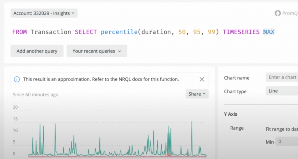
If you’d like to get started writing your first NRQL queries today, use the New Relic query builder. With the query builder, you can run queries of your data to create custom charts and other visualizations. You can also build custom dashboards containing multiple charts.
To get to the query builder, go to one.newrelic.com and press Ctrl+E to open it.

Filter your queries with Regex
It’s great how NRQL lets you use `OR` statements to combine multiple results. But this has some natural limitations: trying to match all strings that start with letters rather than numbers would take a lot of `OR` statements.
But now, you can use `RLIKE` to use a regular expression for filtering. A query like:
`SELECT count(*) FROM Transaction WHERE hostname RLIKE 'ip-10-351-[0-2]?[0-9]-.*'` lets you tightly control the IPs that match your query. There are some limitations on the complexity of your regex, but if you want to do queries with character ranges, you should be able to do all you need.
Smooth, accurate charts with sliding time windows
"Sliding time windows" sounds a bit like a magical patio door. But it refers to an ability to smooth charts for clearer signaling. Using a sliding time window, a set of small, high spikes will tend to group up into one, more visible spike.
Adding the `SLIDE BY` clause will let each data point contain average data about its neighbors:
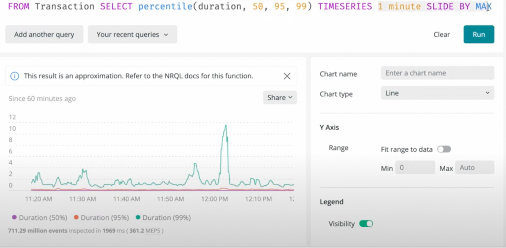
`SELECT average(duration) from Transaction TIMESERIES 5 minutes SLIDE BY 1 minute`
The documentation illustrates how these queries work and how you can use them today.
Nested queries let you simplify further
When you want to reduce cardinality by more than one degree (for example, when you want to see results averaged across time when you have a time x quantity chart), you can now nest your queries to let you further simplify your data.
To see a good example of this, watch the most recent episode of the Nerdlog.
Subscribe to our Nerdlog emails to get weekly updates about the latest features and releases from the people who built them. Join the Nerdlog discussion live every Thursday at 12 p.m. PT (8 p.m. UTC) on Twitch or follow along in What’s New.
If you're not a New Relic customer, sign up for your free account today.

The views expressed on this blog are those of the author and do not necessarily reflect the views of New Relic. Any solutions offered by the author are environment-specific and not part of the commercial solutions or support offered by New Relic. Please join us exclusively at the Explorers Hub (discuss.newrelic.com) for questions and support related to this blog post. This blog may contain links to content on third-party sites. By providing such links, New Relic does not adopt, guarantee, approve or endorse the information, views or products available on such sites.

