If you’re like most engineers, you may find yourself parsing through data from more sources than ever before. Chances are that you need a way to visualize and customize all the data to fit your organization’s needs, and report and efficiently communicate your analysis to different stakeholders. Starting from scratch isn’t the most efficient way.
The good news is that you don’t have to start from scratch. As a New Relic One user, you can begin accessing new dashboards and custom visualization capabilities today that give you access to a library of dashboards, third-party custom visualization capabilities, and quickstart visualizations, based on common use cases in the New Relic One Catalog and the New Relic One Dashboard API.
Visualize your data from scratch or a quickstart
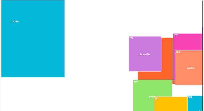
If you would like a custom visualization, you can create smaller-scale custom widgets and pin them to a dashboard. Is there a visualization you like in a popular JavaScript charting library like D3 or Recharts? You can now use it in your custom visualization connected to the data already in the Telemetry Data Platform. Are you looking for maps, heat maps, and traffic lights to visualize your system movements? We have you covered.
To make it even easier to find the template you want, you can access a Quickstarts Library, a community repository of New Relic dashboards, alerts, and installation instructions. Deploy the app in your account to quickly find the template you want and start using it in your account. Best of all? We built this all in open source, which means you can provide feedback and suggestions on use cases you’re looking to solve. Create an issue or send a pull request—we’re building this library for you and your needs.
Extend capabilities with the dashboards API and customizations UI
New Relic One dashboards provide custom visualizations that can be automated through templates and a full dashboard CRUD API, with custom chart widgets built with React.js, the ability to pull in third-party library widgets, and a library of templates to get started fast—and all of it in open source.
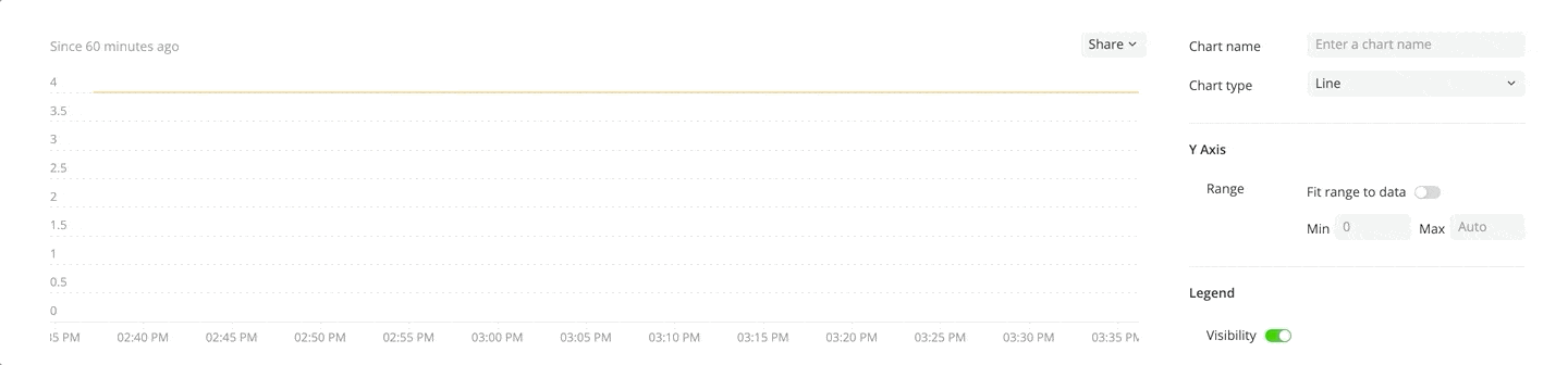
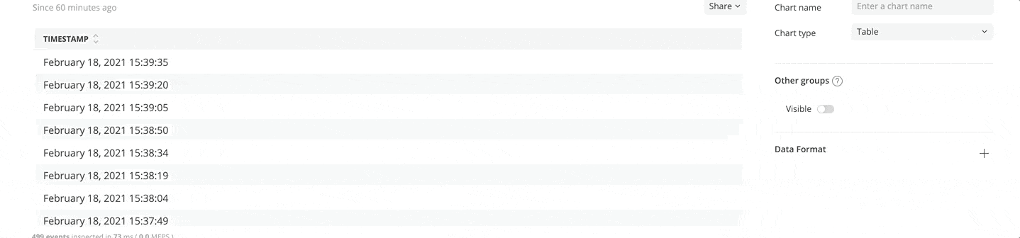
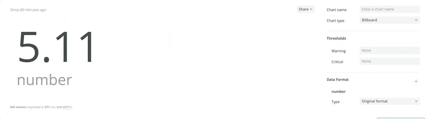
With the recent customization updates, you can now quickly add widgets directly to dashboards simply by clicking “add to dashboards” in the Query Builder. You can also customize existing widgets to display data as you need it:
-
- Number and time formatter: Define decimals (e.g., number of 9s in your SLO) and formatting your dates and timestamps (e.g., US format or EU format)
- Customize y-axis: You can now define how you want your y-axis to behave by setting it to a specific value and ignore outliers
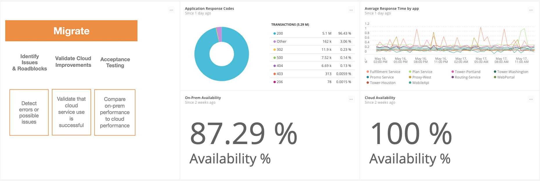
As a busy engineer, reducing toil is a must. You can use the API to deploy a standard set of dashboards for every new service you create. And if you need inspiration, a large inventory of pre-built custom dashboards reflect observability best practices. You’ll find a range of subject areas, including infrastructure monitoring, cloud, browser, and mobile monitoring.
Let’s build together
We designed these new capabilities to help you innovate. We’re continuously listening to your feedback and adding more templates, resources, and visualizations to our libraries. Because we’re invested in working in the “open source way” and providing you transparency, our visualization builder pulls from the open source ecosystem, so you can visualize data in any way that you prefer. If you have feedback or suggestions, please feel free to submit it through New Relic One. We’re building an extensive library and we encourage you to join us.
Check out developer.newrelic.com to learn more.

The views expressed on this blog are those of the author and do not necessarily reflect the views of New Relic. Any solutions offered by the author are environment-specific and not part of the commercial solutions or support offered by New Relic. Please join us exclusively at the Explorers Hub (discuss.newrelic.com) for questions and support related to this blog post. This blog may contain links to content on third-party sites. By providing such links, New Relic does not adopt, guarantee, approve or endorse the information, views or products available on such sites.

