New Relic is pleased to announce general availability of Health Map, our innovative visualization that integrates our industry-leading application and infrastructure monitoring data to help operations teams understand and troubleshoot their applications.
As organizations shift towards microservices on ephemeral systems, ops and DevOps teams often find it increasingly difficult to fully understand all the dependencies for their applications. Health Map is a high-density, color-coded view that shows the health of all your applications as well as the health of the infrastructure hosts where those applications are deployed.
The importance of tracking application to infrastructure dependencies
The performance of modern applications is increasingly tied to understanding the infrastructure hosts that the application relies upon. In modern architectures, a web application is often replicated and dependent upon multiple dynamic infrastructure resources. Every time a customer touches your web application, a load balancer directs traffic to one of those application instances that in turn rely on highly dynamic infrastructure.
Keeping track of the relationships between one application and its ever-changing hosts can be hard, and many operations teams are charged with tracking hundreds of applications across a complex network of hundreds of hosts. When a performance issue arises, it can be exceedingly difficult to determine whether the source of the issue lies in the code or with one of the infrastructure hosts. What’s needed is a straightforward way to see the big picture of the applications you’re maintaining and also be able to confidently drill down into the infrastructure supporting them to troubleshoot issues.
Enter Health Map: Transforming your Network Operating Center wallboard
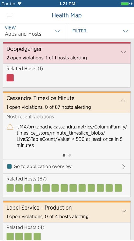
With Health Map you get one integrated, prioritized view of your applications. While many ops teams must look in separate views or even separate tools to see application and infrastructure health, Health Map delivers one combined view of all of your applications and the infrastructure hosts that the applications depends on. Better still, Health Map detects these relationships automatically—no configuration required!

Each card provides a color-coded visualization of both application and infrastructure health, along with basic metrics such as Apdex (application performance index), error rate, and throughput for applications and CPU%, memory%, and load average for hosts. The data points and color coding are generated seamlessly based on data and alerting policies that have been set up in New Relic APM and New Relic Infrastructure.
When troubleshooting an issue, you can use filters that help quickly find applications or hosts that you’re particularly interested in based on the labels that you’ve set up. You can then mouse over any particular unhealthy application or host to see the open alert violations. Once an area of analysis has been identified, you can click on the application or hosts to go deeper into the issue within New Relic APM or Infrastructure. And all of these powerful insights are available on the go in your New Relic mobile app.
Watch the short demo video below to see how much more effective you can be in pinpointing errors within your applications with New Relic Health Map:
Try Health Map now!
If you’re a New Relic APM and New Relic Infrastructure customer, find the “Maps” link in your New Relic navigation and give Health Map a spin. Make your Health Map more even more powerful by defining useful alert conditions for your applications and hosts. And if you’re an APM customer who hasn’t yet taken the plunge with Infrastructure, now is a great time to get started. With a 30-day free trial, you can see your application and infrastructure health more clearly through Health Map. Want to learn more about what Infrastructure has to offer? Read up on Infrastructure Monitoring here.
For more information:
- Health Map documentation
- New Relic Alerts documentation
- New Relic Infrastructure information and sign-up
- New Relic APM information and sign-up

The views expressed on this blog are those of the author and do not necessarily reflect the views of New Relic. Any solutions offered by the author are environment-specific and not part of the commercial solutions or support offered by New Relic. Please join us exclusively at the Explorers Hub (discuss.newrelic.com) for questions and support related to this blog post. This blog may contain links to content on third-party sites. By providing such links, New Relic does not adopt, guarantee, approve or endorse the information, views or products available on such sites.


