Every team needs data to understand how the software they deliver impacts their end users. But even though modern teams have access to more data, from more sources, than ever before—all that data doesn't always make things easier. To drive timely action, teams need access to dynamic—not just static—data visualization dashboard tools, so they understand what's happening in their software in real time. When problems occur, they need fast and simple, yet still powerful, ways to drill into performance data and create custom visualizations that help them diagnose and fix those issues fast.
 New Relic is excited to announce new capabilities that make it easier than ever for teams to quickly explore data and create dashboards that achieve these goals while also meeting their unique needs. This major update to New Relic dashboards, along with a new chart builder, are available today to all our customers, in New Relic One, the industry's first entity-centric observability platform.
Faster and better dashboards: 3 key questions
When we launched New Relic Insights in 2014, it empowered engineers in new ways. They could query billions of records, and get results in seconds. They could create live dashboards in minutes. And they could finally connect their monitoring data to business outcomes by adding attributes to that data for filtering and faceting. Thousands of New Relic customers now use Insights every day.
But in the last five years, building software has gotten dramatically more complex and end-user expectations are higher than ever. So we’ve been working to do more for our customers facing these challenges. Specifically, we zeroed in on three questions:
- How can we make these tools accessible and useful for customers by giving them direct access to truly self-service data-visualization tools and dashboards?
- How can we create more impactful data visualizations by helping customers understand what they're seeing and identify correlations faster and with greater confidence?
- How can we simplify and accelerate the process of creating data visualizations by integrating these tools and making them a foundational element of the New Relic user experience?
Addressing these questions drove the new capabilities we are announcing today.
Chart builder: Explore your data and create charts
New Relic Query Language (NRQL) is the key that unlocks access to the data customers collect in New Relic. NRQL is a SQL-like language that we created to aggregate and filter the data flowing into the New Relic platform from instrumented applications and infrastructure components. This powerful and versatile tool drives many of the curated product experiences throughout New Relic. Like a surgeon’s scalpel, it lets customers ask very specific questions of their data, turn the answers into compelling data visualizations, and aggregate and organize these visualizations as dashboards.
Anyone can learn the basics of NRQL and use it to write queries. We’ve seen New Relic power users create amazing visualizations in complex environments. But we wanted to go further to help a broader set of customers easily get more value out of their without having to become NRQL experts—which led to the creation of the creation of our new point-and-click query tool and chart builder.
Basic mode: The surprising power of point-and-click
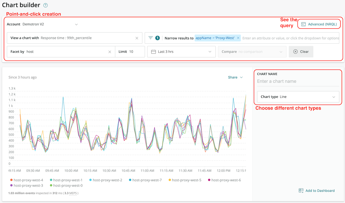
In basic mode, customers get an intuitive point-and-click interface for creating charts. You select a query type (response time, for example) against specific sources (such as hosts), and then narrow and shape the results (filtering by name, location, a defined length of time, and other parameters). Basic-mode users can also compare multiple data sets (useful for identifying correlations) and choose the type of visualization they want to use.
These basic-mode capabilities let users unfamiliar with NRQL create custom charts quickly. This expands the number of people within your organization who can ask and answer questions of the data from all their entities. (For more on entities, see Why Be Entity-Centric). At the same time, basic mode reduces the burden on experienced NRQL users who previously had to field most requests. Most important, customers who work directly with chart builder are more likely to obtain timely results, devote more time to iterating and experimenting with their queries, and find innovative ways to get value from these tools.

Smoothing the learning curve to advanced mode
Of course, many New Relic customers have experience working with NRQL, and others will graduate from basic mode before to working directly with NRQL queries. These users can use chart builder’s advanced mode to craft and edit NRQL queries directly. And users of all experience levels will fill gaps in their knowledge while staying productive and engaged with new features that enable quick and easy movement between basic and advanced modes:
- One-click access to view the generated NRQL and write or revise queries directly—allowing customers to move back and forth between modes to see in real time how changing the underlying code changes the results of their queries.

Chart builder advanced view: quick and convenient access to the full power of custom NRQL queries.
- Hovering over a default NRQL data type in chart builder reveals a brief definition of that data type. This gives customers who want to learn more about NRQL an easy reference for data types while helping experienced users expand or refresh their knowledge.
- New substring search support auto-populates search results as customers enter search terms. This familiar search feature delivers results faster and helps build knowledge of NRQL data types and other searchable elements.
- New advanced filtering tools dynamically filter dashboards on common attributes (for example, "equals," "does not equal," "contains," and so on). These tools make it easier to set up compound and complex data filtering conditions, which help customers get exactly what they need from large, complex, and often heterogeneous data sets.
Dashboards and data usability: making connections that matter
In the context of business KPIs, creating the right data visualizations is essential for distilling data into actionable insights. The visuals that you create tell a clear and consistent story, giving viewers the context to make sense of what they're seeing and providing visual cues that enable them to spot patterns and decide what's important.
Bringing clarity to dashboard data
Two of the most impactful visual usability improvements in our dashboards are also among the most straightforward:
- When customers apply a facet to multiple charts within a dashboard, New Relic displays that facet with the same color. This simple tactic leverages the human brain's pattern-matching skills—helping us to "connect the dots" across different aspects of a performance issue or business question.

Facets that appear in multiple charts on a dashboard use the same identifying color—a simple but powerful usability enhancement.
- A new “correlation needle”—a vertical overlay that appears across all charts of the same type when a user hovers over one chart. The needle gives customers a clear visual point of reference for correlating data across related charts; it also displays the minimum and maximum values of the highlighted facet, which helps users assess a facet's natural variability and dynamics.

The "correlation needle" in New Relic One dashboards gives customers a clear visual point of reference for correlating data across related charts.
New ways to deal with density
Additional improvements in New Relic's chart builder and dashboards improve usability for visual elements that present a lot of information in a limited amount of space:
- Our new "scrubber" feature improves legibility of crowded line charts—especially when many facets share similar values and value ranges. It lets customers hover over a specific facet to clearly display that facet's data points.
- Our new drag-to-zoom feature highlights a time segment on a line or area chart, and automatically zooms into the selected duration. That way users can quickly go from a longer-term view of time-series data, for example, to drill down to potentially important short-term details. Customers can apply this feature to a single chart or across an entire dashboard—another helpful way to find and understand correlations within the data.

"Drag to zoom" functionality in New Relic One dashboards makes it easy to drill down quickly into time-series data—whether you're viewing a single chart or an entire dashboard.
- Our new inline scroll feature can preserve and present a chart or table in its entirety, even when a table or chart contains more data than can be displayed in the allotted space on a dashboard. No more truncating the data visualization, which could force customers to re-run large or complex queries.
New layout and presentation options
We also improved the usability of data visualizations and dashboards by making them more versatile, giving customers more options for creating useful, relevant, and accessible dashboards:
- Dashboards in New Relic One support up to 12-column layouts. Previously, charts created with Insights supported only 3-column layouts—a challenge for organizations seeking to understand large and disparate systems on a single dashboard.

Dashboards in New Relic One now support up to 12-column layouts.
- New display-mode options include a full-screen mode and a high-contrast "dark mode." Together, these features dramatically improve dashboard legibility on televisions and large-screen displays—an important consideration in network operations centers and other "war room"-type environments.
- New options to share dashboard data using print formats. Integrated tools to export charts (in PNG format) and dashboards (as PDFs) give customers more ways to share charts and dashboards, especially when digital content may not be the best solution.
New integration and access options
Our new chart builder and dashboard experience includes a set of capabilities that create value through integration—embedding direct access to data visualization and dashboard management tools within every aspect of the New Relic experience. These features empower customers to explore their data when and where they want—without leaving the environment where they're working.
Chart builder access made easier
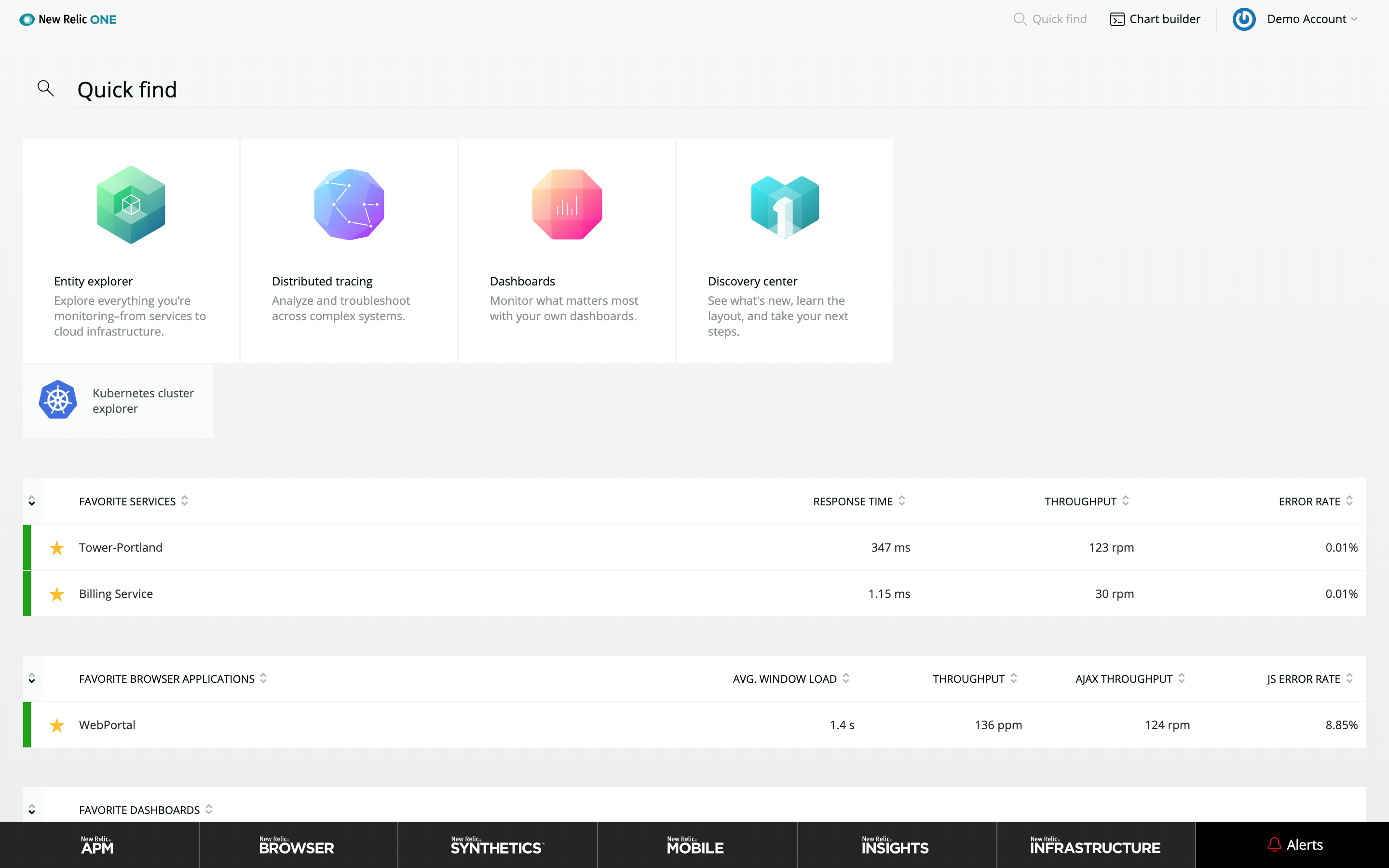
The most obvious example is our now-ubiquitous chart-builder icon, which appears in the navigation bar at the top of the New Relic One interface. It ensures that every user is never more than one click away from accessing the full chart-builder experience.

In addition, customers can:
- Add newly created charts directly to any dashboard to which they have access.
- Call the chart builder interface any time they view and edit a NRQL query (whether in a dashboard, the entity overview, or any other location).
- Use the new global query bar to explore their data anywhere, at any time, within the New Relic One environment.
- Open NRQL views of any chart, anywhere in New Relic. This is helpful for advanced users or anyone interested in learning how to craft queries directly.
Dashboards that do more—and do it all better
Beyond making it easier to access the chart builder and query tools, we also added three new capabilities designed to make it easier to create and manage dashboards:
- Create, customize, and clone dashboards from anywhere in the New Relic platform, using almost any available data source. It’s now possible, for example, to save service maps as a custom widget and then add that widget into a dashboard. Any dashboard can display any type of visualization or data source; no need to define in advance a dashboard type or otherwise limit how you use a particular dashboard.

Any dashboard can display any type of visualization or data source (such as a service map, as shown here). - A new tag API makes it easy to organize and search across dashboards, and to favorite dashboards. All New Relic customers can benefit from quick, personalized access to dashboards when and where they’re needed.
- Support for dashboard (and chart-level) CRUD (CReate, Update, Delete) controls within chart action menus. If you have permission to access a dashboard, you also have easy access to these basic management capabilities.
Improved data tools offer something for everyone
Looking at the big picture, New Relic One empowers teams to extract useful insights from ever-increasing amounts of data, and to communicate those insights in ways that support timely and effective decision-making. Those are important benefits—but we understand that users are also concerned about the time, energy, and effort required to achieve them.
That’s why we designed these new capabilities to leverage our existing dashboard technology. All of the time and effort your team has already put into building dashboards is still there; dashboards created using Insights are accessible from within New Relic One, and vice versa. And while some of our new capabilities will not be available within Insights (for example, the 12-column layout model), the dashboards are.
There’s truly something for everyone in our new chart builder experience and dashboard capabilities. We’ve worked hard to give our customers a set of tools that make it easy to experiment, learn, and improve. We’re looking forward to seeing where our customers go with these new capabilities—and we hope you’re looking forward to using them.
Learn more about New Relic One at newrelic.com/platform.
Additional New Relic One resources
- New Relic One
- New Relic One press release
- New Relic One data sheet
- Introducing New Relic One: Our Platform for the Next Decade
- New Relic One: Deliver More Perfect Software Faster
- New Relic One: Why Be Entity-Centric?
- Global Trace Search in New Relic One: A Better Way to Work with Custom Attributes
- New Relic documentation: Introduction to New Relic One
- Introducing New Relic Monitoring for AWS Lambda
Die in diesem Blog geäußerten Ansichten sind die des Autors und spiegeln nicht unbedingt die Ansichten von New Relic wider. Alle vom Autor angebotenen Lösungen sind umgebungsspezifisch und nicht Teil der kommerziellen Lösungen oder des Supports von New Relic. Bitte besuchen Sie uns exklusiv im Explorers Hub (discuss.newrelic.com) für Fragen und Unterstützung zu diesem Blogbeitrag. Dieser Blog kann Links zu Inhalten auf Websites Dritter enthalten. Durch die Bereitstellung solcher Links übernimmt, garantiert, genehmigt oder billigt New Relic die auf diesen Websites verfügbaren Informationen, Ansichten oder Produkte nicht.


