Are you new to New Relic? Looking to get a little deeper than the overview graphs? This is the introduction in a series of New Relic walkthroughs. Use this guide to learn how New Relic helps maximize your entire tech stack's performance, efficiency, and security.
The New Relic UI exposes a lot of information, and when getting started with the platform, it can be easy to miss available functionality. To get the most from New Relic, we recommend that you explore our documentation, beginning with the application performance monitoring (APM).
This section goes into application monitoring in detail. You can get information on each of the following categories:
- Installing New Relic using agents
- Using your logs in context with your application data
- Reviewing the screens in the APM summary page
- Diving deeper into transactions
Our docs also include a best practices guide about monitoring your software performance that you can dig into for specifics.
To get started quickly now, here are some highlights that will save you some time as you start to explore New Relic.
Welcome to New Relic video
This 3-minute video introduces New Relic and an example of a Node.js app instrumented with New Relic. Imagine you’re responding to customer complaints of performance issues with your application. The video quickly walks through how to use New Relic to see performance of backend services and the infrastructure hosting services, how to use logs, and how to look at frontend issues using browser monitoring.
APM and services summary
The APM & services > Summary UI details the overall state of your application. It’s an excellent place to see your software performance at a glance—from web transaction times, throughput, error rates, the top 5 slowest transactions, and a list of servers or containers running the app. There’s a great deal of data here to be found, and you can click through to dive deeper into any category.
Click the dropdown with the clock icon in the top right of the page to adjust the time frame of the data displayed on this page. You can also make further selections to select specific transaction types and instances or display historical comparisons that will let you see how your performance has changed over the past day or week.
The right panel shows you connected entities, related data, and an activity stream to ensure you have a complete view of your application's performance and how it impacts or depends on other services.
Web transactions
The Web transactions UI shows where your app spends most of its time and effort, and causes the most user dissatisfaction. It’s also where you can find overview details about a type of transaction, as well as specific recorded slow transactions including HTTP parameters and charts that show your most time-consuming transactions and throughput over time.
The number one under-used feature on this page is the Sort By dropdown. This is where you can view the transactions consuming the most time, but you might be more interested in the flat-out slowest transaction or transactions with the highest error rate.
External services
The External services UI shows detailed throughput and response graphs about the services you contact via HTTP. This data can be sorted by most time-consuming services, slowest average response time, and throughput.
Logs
The Logs UI shows your logs in context to the specific entity and timeframe you select for a specific time. Working with logs with this context makes it easy to query and find specific details about your application without switching tools.
Access New Relic from your mobile device
To stay on top of critical issues, even if you’re away from your desk, use our mobile app (iOS and Android). Get real-time alerts, then dive into system performance to quickly detect and diagnose problems without losing valuable time.
You'll get access to APM, dashboards, NRQL, New Relic Explorer, real user monitoring (browser monitoring and mobile monitoring), as well as synthetic monitoring and infrastructure monitoring.
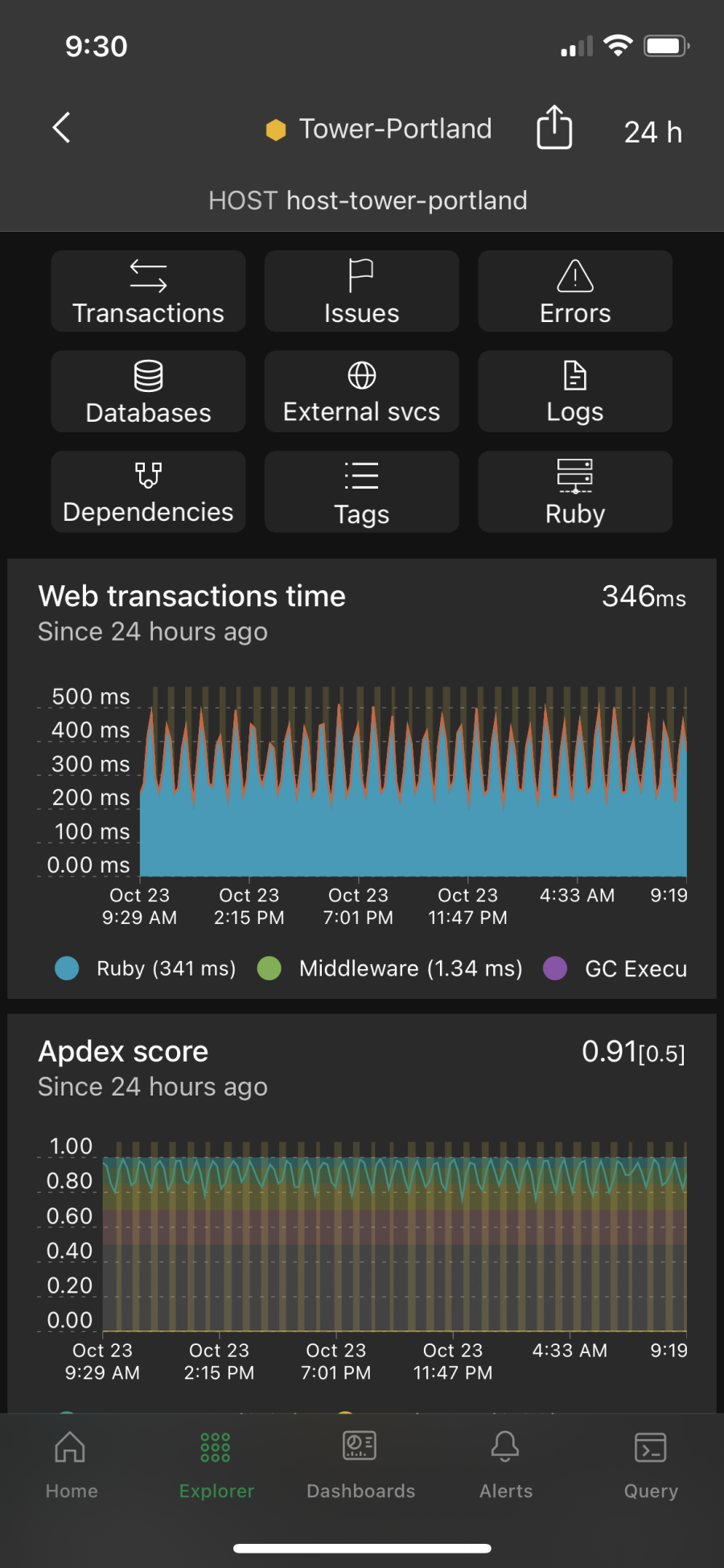
Here's what an APM dashboard looks like in the iOS app:

Here's what an APM dashboard looks like in the Android app:
Nächste Schritte
If you’re looking for a good follow-up to this post, check out our Introduction to the New Relic platform documentation or learn how to solve your app’s performance issues with tutorials.
To advance from learning observability concepts to becoming a hands-on practitioner, create a free New Relic account. Your free account includes 100 GB/month of free data ingest, one free full-access user, and unlimited free basic users.
We’ll be running follow-ups to this post soon, so remember to check back later. And if you’d like us to cover anything in the future, let us know in the New Relic Explorers Hub or reach out on the New Relic Community Slack channel.
Die in diesem Blog geäußerten Ansichten sind die des Autors und spiegeln nicht unbedingt die Ansichten von New Relic wider. Alle vom Autor angebotenen Lösungen sind umgebungsspezifisch und nicht Teil der kommerziellen Lösungen oder des Supports von New Relic. Bitte besuchen Sie uns exklusiv im Explorers Hub (discuss.newrelic.com) für Fragen und Unterstützung zu diesem Blogbeitrag. Dieser Blog kann Links zu Inhalten auf Websites Dritter enthalten. Durch die Bereitstellung solcher Links übernimmt, garantiert, genehmigt oder billigt New Relic die auf diesen Websites verfügbaren Informationen, Ansichten oder Produkte nicht.


