When New Relic became the first programmable observability platform, we gave you the same tools our own engineers use to build custom user interfaces (also known as applications) within New Relic. We even started an open source library of example applications to help you construct your own modular New Relic applications.
Then, we also heard that you wanted a way to generate smaller-scale custom widgets for your dashboards. You want to visualize and communicate your data in unique ways beyond the usual charts and graphs, without having to build a full application.
That’s why we introduced custom visualizations, allowing you to build custom chart widgets with React.js, pull in various telemetry data sources, pin them to your dashboards, and use open source charting libraries. Coding charts are now easy to accomplish.
But what if getting started with custom visuals was even easier?
New Relic and Formidable team up for ready-to-use custom charts

Partners in open source: New Relic and Formidable
During FutureStack 2021, we announced that New Relic is partnering with Formidable, a global design and engineering consultancy specializing in open source software, to integrate charts from their charting library, Victory, directly into the New Relic catalog.
That’s right! You can now work with pre-built custom charts. There's no need to edit index.js code or configure JSON files. All you need to do is subscribe to the Victory Charts Visualizations app, choose a chart type, and enter your NRQL query.
Three brand new chart types, and more to come
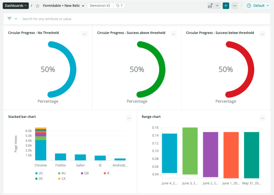
We’ve been working closely with the team at Formidable to build NRQL-based visualizations on top of the Victory charting library. The first batch of new chart templates are available to all New Relic users:
- Stacked bar chart: Visualize related facets with respect to some numeric or aggregate attribute.
- Range chart: Visualize the range of numeric attributes grouped by a facet (for example, the first and third quartiles across groups).
- Circular progress bar: Create a bold representation of your progress towards a goal or limit, with the ability to choose if crossing the threshold is good or bad.

New chart types like these are now available.
But wait, there’s more! We’re continuing the partnership and working with the Formidable team to release more charts on an ongoing basis.
Want to request a specific chart from the Victory library? Let us know in the discussion board with the tag victoryvisualizations.
Victory in seconds: how to get started
Adding a Victory chart to your dashboard is simple. Here’s how to get there from anywhere on the New Relic platform:
- Go to the New Relic app catalog, and select Nerdpacks that include
Visualizations. - Click Victory Charts Visualizations, click add this app, and select the accounts you want to have access to it.
- Go to the Artifacts tab and select the chart type you want by clicking open visualization.
- Select an account to draw data from, then enter your query (or use the example query provided). Click Update query to see your data in action.
- Click Add to dashboard and select the destination.
After these steps, your new visualizations are added to your Custom Visualizations library for quick access going forward.
This video walks through using Victory charts for your visualizations in New Relic:
See how easy it is to add a new chart in this short demo video.
About Formidable and open source
Formidable is a global design and engineering consultancy and open source software organization that specializes in React.js, React Native, GraphQL, Node.js and the extended JavaScript ecosystem. They have locations in Seattle, London, Toronto, Denver, Atlanta, and Phoenix with remote consultants worldwide. For more information, see formidable.com.
As part of our commitment to open source and giving developers the power to extend the New Relic experience, we are inspired to work with a team like Formidable that specializes in OSS development.
In addition to quickly adding Victory charts to your dashboards, you can also use these templates to expand on the code already provided. It’s all open source!
We’re excited to help you jumpstart customizing your dashboards, and can’t wait to see what you build.
Nächste Schritte
Here are some more resources to continue your custom visualizations journey:
- Read the steps to get started with the Victory Charts Visualizations Nerdpack by New Relic Senior Engineer Robert Tyree.
- Want to tweak a Victory visualization? Read the developer's guide to customizing an open source Nerdpack.
- Want to go beyond templates? Check out our developer’s guide to building your first custom visualization.
- Already know a bit about building on New Relic? Get your expertise validated by completing the New Relic Programmability Certification.
Die in diesem Blog geäußerten Ansichten sind die des Autors und spiegeln nicht unbedingt die Ansichten von New Relic wider. Alle vom Autor angebotenen Lösungen sind umgebungsspezifisch und nicht Teil der kommerziellen Lösungen oder des Supports von New Relic. Bitte besuchen Sie uns exklusiv im Explorers Hub (discuss.newrelic.com) für Fragen und Unterstützung zu diesem Blogbeitrag. Dieser Blog kann Links zu Inhalten auf Websites Dritter enthalten. Durch die Bereitstellung solcher Links übernimmt, garantiert, genehmigt oder billigt New Relic die auf diesen Websites verfügbaren Informationen, Ansichten oder Produkte nicht.


