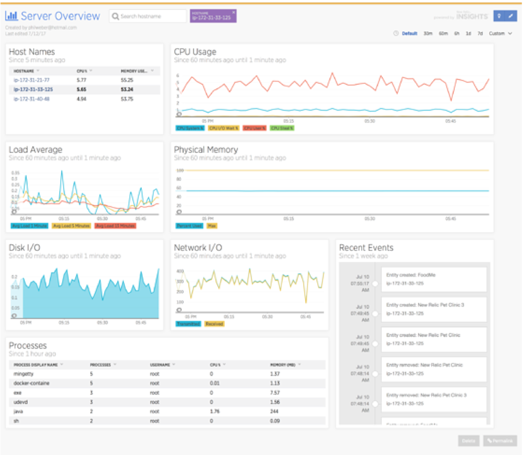
New Relic Infrastructure gives you real-time, searchable, filterable visibility across your entire infrastructure. But what if you want to view key metrics about a server on a single dashboard? Thanks to New Relic Insights, you can!
Because Infrastructure stores its data in the New Relic Database (NRDB, the same data store used by Insights), it’s easy to create a Server Overview dashboard. In this post I’d like to walk you through how it’s done.
Building a Server Overview dashboard
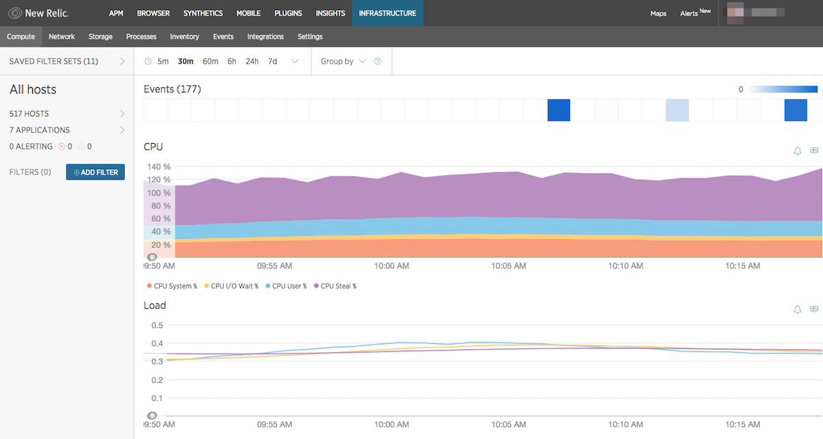
First, log into your New Relic account and navigate to Infrastructure’s Compute page:
If you look closely above each chart, you’ll notice a small icon that resembles a chart on an easel:
![]()
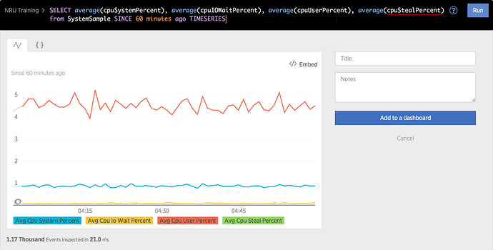
Click this icon to open the chart’s underlying NRQL query in Insights:

From here, you can customize the query, give the chart a title, and add it to a dashboard.
The NRQL AS clause allows you to customize the label of a query attribute. Let’s add some AS clauses to make the chart legend easier to read. Change the NRQL query to
SELECT average(cpuSystemPercent) AS 'CPU System %',

       average(cpuIOWaitPercent) AS 'CPU I/O Wait %',

       average(cpuUserPercent)   AS 'CPU User %',

       average(cpuStealPercent) AS 'CPU Steal %'

FROM SystemSample

SINCE 60 minutes ago TIMESERIES
Click the Run button to execute the query. Give the resulting chart a title, such as “CPU Usage,” and click Add to a Dashboard. In the Add to a Dashboard dialog, select Add to a new dashboard and give your new dashboard a name, such as “Server Overview.”
Now go back to Infrastructure and repeat the process for the Load and Memory charts.
Infrastructure draws a custom chart to display Used and Available memory as a stacked-area chart. Unfortunately, it is not possible to replicate this chart in Insights. Instead, change the NRQL query to
SELECT average(memoryUsedBytes / memoryTotalBytes * 100)

AS 'Percent Used', 100 AS 'Max'

FROM SystemSample

SINCE 60 minutes ago TIMESERIES
The SELECT...100 AS 'Max' clause forces the Y-axis to a scale of 0 to 100, allowing us to display the memory used as an easy-to-read percentage.
From Infrastructure’s Storage page, change the chart to display Total Utilization %, view the query in Insights, and change it to
SELECT average(totalUtilizationPercent)

FROM StorageSample

FACET entityAndMountPoint

SINCE 60 minutes ago TIMESERIES
To display network throughput, use the following query:
SELECT average(transmitBytesPerSecond / 1024) AS 'Transmitted',

       average(receiveBytesPerSecond / 1024) AS 'Received'

FROM NetworkSample SINCE 60 minutes ago TIMESERIES
It can be helpful to see which processes are running on a server, in case one of them is consuming a large amount of CPU or memory, for example. You can use the following query to display a list of running processes, the name of the user who started each process, and how much CPU and memory each process is using:
SELECT uniqueCount(processId),

       latest(userName),

       average(cpuPercent) AS 'CPU Percent',

       average(memoryResidentSizeBytes) / 1024 AS 'Memory (MB)'

FROM ProcessSample

FACET processDisplayName SINCE 1 hour ago
New Relic Infrastructure captures information about system events, such as user logins, package deployments, etc. Let’s add a widget to our dashboard to display recent events:
SELECT * FROM InfrastructureEvent SINCE 1 day ago
Finally, we need a way to select an individual host, so we can see an overview of a single server. Let’s add a table based on the following query:
SELECT average(cpuPercent) AS 'CPU %',

       average(memoryUsedBytes / memoryTotalBytes) * 100

AS 'Memory Used %'

FROM SystemSample

FACET hostname

SINCE 5 minutes ago LIMIT 10
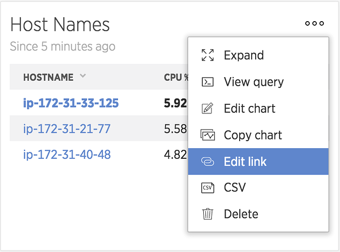
That query displays the Top 10 host names reporting to your account, in order of CPU usage. After adding the above table to your dashboard, click the ellipsis icon in the upper-right corner of the chart widget and select Edit link:

In the resulting Link to dashboard dialog, link the widget to the Current dashboard and save your changes.
Now you can select a host name from the table to filter the dashboard to that host:
To view the information for a host that’s not included in the Top 10, click in the Search hostname field at the top of the page and select the desired hostname.
Creating custom dashboards is easy
Pulling key server metrics into a single dashboard takes just a few minutes; now you can easily see the status of an individual server at a glance. Because New Relic Infrastructure stores its data in NRDB, it’s easy to export and customize charts from Infrastructure to Insights, and create custom dashboards that display whatever information you want to see.
For more information on using New Relic Insights to share and view Infrastructure data, check out the documentation.
Les opinions exprimées sur ce blog sont celles de l'auteur et ne reflètent pas nécessairement celles de New Relic. Toutes les solutions proposées par l'auteur sont spécifiques à l'environnement et ne font pas partie des solutions commerciales ou du support proposés par New Relic. Veuillez nous rejoindre exclusivement sur l'Explorers Hub (discuss.newrelic.com) pour toute question et assistance concernant cet article de blog. Ce blog peut contenir des liens vers du contenu de sites tiers. En fournissant de tels liens, New Relic n'adopte, ne garantit, n'approuve ou n'approuve pas les informations, vues ou produits disponibles sur ces sites.


