Since we launched Dashboards in New Relic One, we have focused on helping teams quickly explore, visualize, and act on their data. We’ve also expanded the ecosystem to give developers the flexibility to create custom visualizations and the programmatic control to create dashboards as code.
Building software continues to become more complex, and the users of your applications have higher expectations. So to continue the mission of enhancing the data visualization experience, we have recently released feature enhancements that help you:
- Do more with visualizations and dashboards,
- Do it faster, and
- Do it easier.
More visualization options
In case you missed it, New Relic has partnered with Formidable to provide ready-to-use custom visualizations from the Victory open source charting library. That means you have more options to visualize your data—all in a few clicks and using your existing NRQL queries.
Charts now available in the Victory library include:
- Circular progress bar: Create a bold representation of your progress towards a goal or limit, and choose if crossing the threshold is good or bad.
- Scatter plot: Get a quick, digestible view into non-aggregate or aggregate data, using up to four query attributes in one visualization.
- Range chart: Visualize the range of numeric attributes grouped by a facet (for example, the first and third quartiles across groups).
In addition to the new visualizations options in the Victory charts library, you can also use stacked bar charts as a new default chart type.
Faster analysis
The New Relic platform lets you analyze more than 50 billion events in one query. As a result, a dashboard with multiple pages of visualizations can pull billions of data points at a time. But what good is all that power without speed?
Now we have reduced 95th percentile dashboard loading time by more than 60%! So you get to the insights—and the beautiful dashboards you’ve built—even faster.

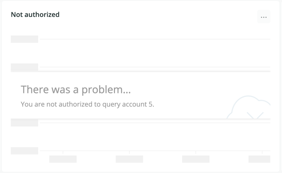
Sometimes you’re slowed down because something went wrong. We know that the most frustrating thing is when error messages don’t tell you what that something is!
To help solve this frustration, charts have more precise querying error messages. Now you can identify the issue and troubleshoot it faster, whether it’s an authorization issue or a simple syntax mistake.


Easier workflows
Have you ever wanted to borrow a visualization from other parts of the platform such as Logs or in Lookout for your own dashboards? With the new Add to dashboard feature, you can!
And now every visualization on the platform lets you view the query behind it. You can adjust it to your liking after you have pinned the widget to your dashboard.
And, finally, duplicating widgets and dashboards is now as simple as clicking a button.
Étapes suivantes
We want to continue making data visualizations and dashboards more useful, faster, and easier for you. If you have any suggestions, let us know in the Explorers Hub.
You can also learn more about Victory charts from Formidable in this Nerdlog episode.
Les opinions exprimées sur ce blog sont celles de l'auteur et ne reflètent pas nécessairement celles de New Relic. Toutes les solutions proposées par l'auteur sont spécifiques à l'environnement et ne font pas partie des solutions commerciales ou du support proposés par New Relic. Veuillez nous rejoindre exclusivement sur l'Explorers Hub (discuss.newrelic.com) pour toute question et assistance concernant cet article de blog. Ce blog peut contenir des liens vers du contenu de sites tiers. En fournissant de tels liens, New Relic n'adopte, ne garantit, n'approuve ou n'approuve pas les informations, vues ou produits disponibles sur ces sites.


