Since we launched Dashboards in New Relic One, we have focused on helping teams quickly explore, visualize, and act on their data. We’ve also expanded the ecosystem to give developers the flexibility to create custom visualizations and the programmatic control to create dashboards as code.
Building software continues to become more complex, and the users of your applications have higher expectations. So to continue the mission of enhancing the data visualization experience, we have recently released feature enhancements that help you:
- Do more with visualizations and dashboards,
- Do it faster, and
- Do it easier.
More visualization options
In case you missed it, New Relic has partnered with Formidable to provide ready-to-use custom visualizations from the Victory open source charting library. That means you have more options to visualize your data—all in a few clicks and using your existing NRQL queries.
Charts now available in the Victory library include:
- Circular progress bar: Create a bold representation of your progress towards a goal or limit, and choose if crossing the threshold is good or bad.
- Scatter plot: Get a quick, digestible view into non-aggregate or aggregate data, using up to four query attributes in one visualization.
- Range chart: Visualize the range of numeric attributes grouped by a facet (for example, the first and third quartiles across groups).
In addition to the new visualizations options in the Victory charts library, you can also use stacked bar charts as a new default chart type.
Faster analysis
The New Relic platform lets you analyze more than 50 billion events in one query. As a result, a dashboard with multiple pages of visualizations can pull billions of data points at a time. But what good is all that power without speed?
Now we have reduced 95th percentile dashboard loading time by more than 60%! So you get to the insights—and the beautiful dashboards you’ve built—even faster.

Sometimes you’re slowed down because something went wrong. We know that the most frustrating thing is when error messages don’t tell you what that something is!
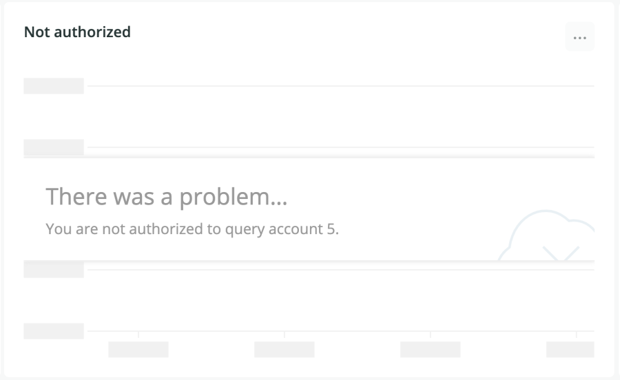
To help solve this frustration, charts have more precise querying error messages. Now you can identify the issue and troubleshoot it faster, whether it’s an authorization issue or a simple syntax mistake.


Easier workflows
Have you ever wanted to borrow a visualization from other parts of the platform such as Logs or in Lookout for your own dashboards? With the new Add to dashboard feature, you can!
And now every visualization on the platform lets you view the query behind it. You can adjust it to your liking after you have pinned the widget to your dashboard.
And, finally, duplicating widgets and dashboards is now as simple as clicking a button.
Próximos pasos
We want to continue making data visualizations and dashboards more useful, faster, and easier for you. If you have any suggestions, let us know in the Explorers Hub.
You can also learn more about Victory charts from Formidable in this Nerdlog episode.
Las opiniones expresadas en este blog son las del autor y no reflejan necesariamente las opiniones de New Relic. Todas las soluciones ofrecidas por el autor son específicas del entorno y no forman parte de las soluciones comerciales o el soporte ofrecido por New Relic. Únase a nosotros exclusivamente en Explorers Hub ( discus.newrelic.com ) para preguntas y asistencia relacionada con esta publicación de blog. Este blog puede contener enlaces a contenido de sitios de terceros. Al proporcionar dichos enlaces, New Relic no adopta, garantiza, aprueba ni respalda la información, las vistas o los productos disponibles en dichos sitios.


